
High-Level Details
Objectives
• Rebrand a personal photography/content creation business into a full-scale creative studio with a digital presence.
• Design a unified identity and interface system from scratch blending structured UI, intuitive navigation, and strong storytelling.
• Build an interactive Android prototype supporting real-world booking and browsing scenarios.
Tools & Assets
• Figma: Full project built in Figma from wireframes to components to prototyping
• Custom Brand Style Guide: Designed from scratch (logo, typography, colors, tone)
• Design System: Defined spacing, typography rules, button styles, interaction states
• Usability Testing: Remote user testing conducted, and findings used to refine layout and functionality
Roles & Collaboration
• Sole Designer: Brand strategist, UI/UX designer, and researcher
• Owned the entire creative direction and design execution
• Iterated visual direction based on feedback from target users
Key Deliverables
• Rebranded identity for Fey Creative Studio (logo, name, visual tone)
• Brand Style Guide with logo rules, color palette, typography and imagery usage
• Design System built with reusable components and interaction states
• Interactive Android prototype for bookings and service browsing
• Usability insights and refinement based on remote testing
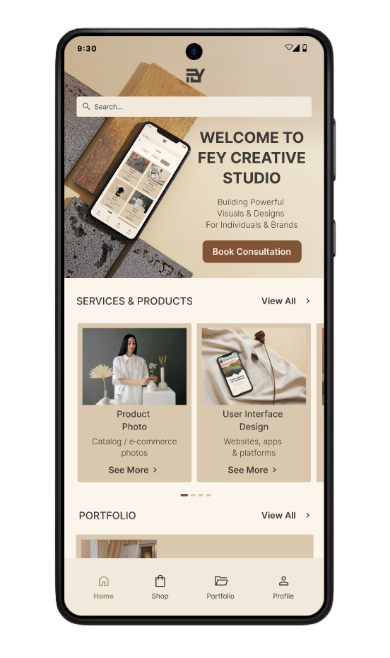
Home Page
Shop/Category Page
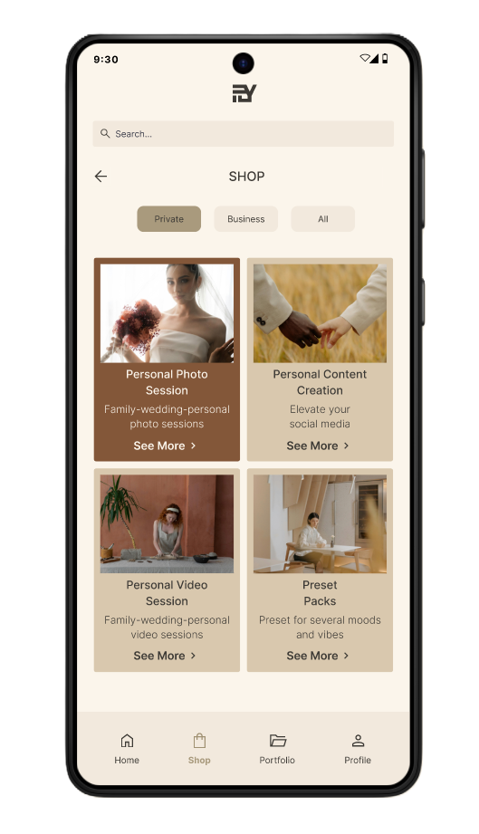
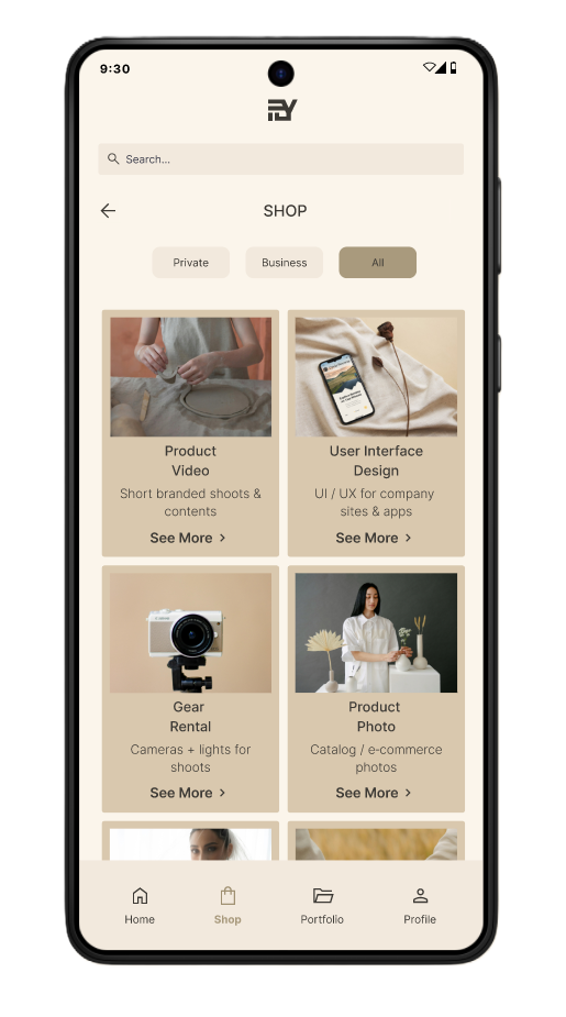
Shop Page/Private
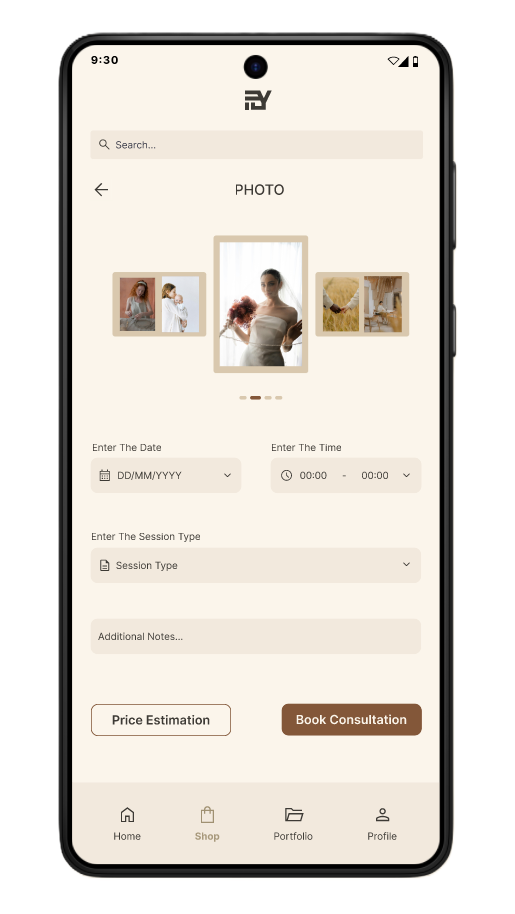
Booking Page
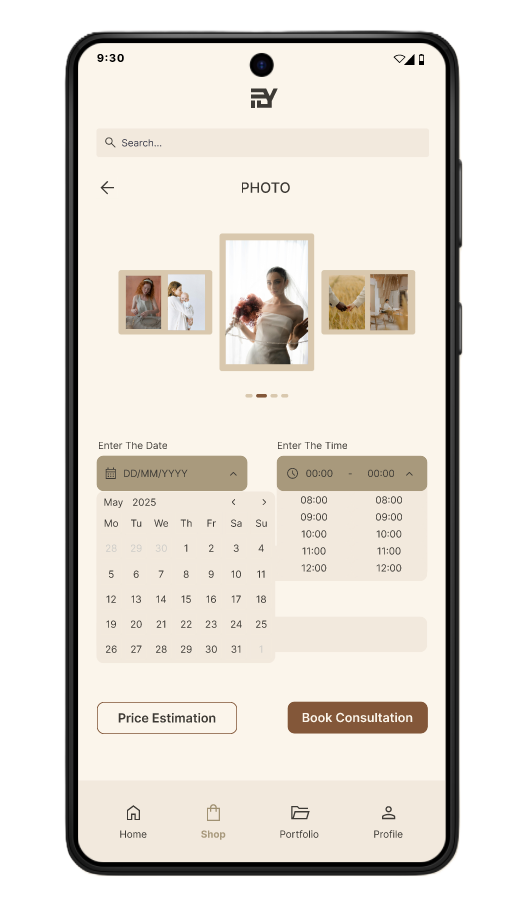
Booking Page
Design Process
Brand Strategy & Planning
• Analyzed my old brand (Studio Fey) and identified limitations
• Defined new core values and positioning for Fey Creative Studio
• Sketched logo concepts and layout ideas
Building the Brand Style Guide
• Designed a scalable logo that works on web, social, and print
• Defined typography pairings and use cases
• Created a color system and usage guidelines
Creating the Design System
• Defined spacing scale, typography, and component variants
• Built reusable buttons, navigation, booking cards, toggles
Mobile App Prototype
• Designed a clean home, shop/category, and booking page
• Developed interactive prototype with key screens and working calendar-time picker
• User followed a scenario: booking a wedding photo session for May 30th at 20:00-22:00
Usability Testing
• Conducted remote usability testing with 5 users
• Observed confusion specifically around the time selection interface
• Originally implemented as a scroll-based selector, which users found unclear
Post-Testing Brand & UI Refinement
After conducting usability testing with five users, I made several refinements based on both user feedback and brand alignment.
• User feedback highlighted confusion in the time selection interface, which I addressed by redesigning the interaction for clarity.
• Additionally, my original prototype featured a brighter yellow accent and a nature green background. While these were visually distinct, they didn’t fully reflect the intended Japandi inspired aesthetic of the brand.
• As part of the post-test iteration, I refined the brand color palette to better express the studio’s minimalist, warm toned identity ensuring consistency across the UI, design system, and branding assets.
Project Links
Explore supporting files and documentation
• A visual foundation: logo, colors, typography, and usage rules.
• Component library, spacing rules, variants, and design details.
• Insights from 5 participants, including feedback, patterns, and fixes.
Conclusion
By reimagining my brand from the ground up, this project gave me full scale ownership from strategy and design to testing and iteration. It highlights my strengths in building visual systems, crafting consistent interfaces, and designing products grounded in storytelling and user needs.